Difference between revisions of "Maggie's care centre, Nottingham"
| Line 36: | Line 36: | ||
'''Cantilevered balconies'''<br> | '''Cantilevered balconies'''<br> | ||
Cantilevered, steel-framed balconies project from three sides, along with a pedestrian bridge to the rear elevation that provides direct access into the building at first-floor level. All four external frames were provided with perimeter balustrading, integral seating and are clad in a combination of glazed, timber and metal louvre panels. Of the balconies, one is a true cantilever and two are cantilevers with prop supports. | Cantilevered, steel-framed balconies project from three sides, along with a pedestrian bridge to the rear elevation that provides direct access into the building at first-floor level. All four external frames were provided with perimeter balustrading, integral seating and are clad in a combination of glazed, timber and metal louvre panels. Of the balconies, one is a true cantilever and two are cantilevers with prop supports. | ||
| − | + | ||
| − | |||
| − | |||
| − | |||
'''Roof contours'''<br> | '''Roof contours'''<br> | ||
In order to maintain the slimline effect of the structure and create a more cost-effective solution, the design used higher strength [[Steel_construction_products#Standard open sections|steel sections]] in grade [[Steel_material_properties#Yield strength|S355]] material. This provided one of the biggest structural steelwork challenges. Where at all possible on the building, [[Fabrication#Section bending|curved steel]] was avoided but its use was essential to create the desired roof contours. Here, the eaves are formed by curved 12.9m beams. | In order to maintain the slimline effect of the structure and create a more cost-effective solution, the design used higher strength [[Steel_construction_products#Standard open sections|steel sections]] in grade [[Steel_material_properties#Yield strength|S355]] material. This provided one of the biggest structural steelwork challenges. Where at all possible on the building, [[Fabrication#Section bending|curved steel]] was avoided but its use was essential to create the desired roof contours. Here, the eaves are formed by curved 12.9m beams. | ||
| Line 46: | Line 43: | ||
“I’m particularly proud of the roof. It’s really pretty and comes out of the geometry of the corners,” says Gough, adding that the similarity to a Chinese pagoda is a homage to Maggie’s interests and background. | “I’m particularly proud of the roof. It’s really pretty and comes out of the geometry of the corners,” says Gough, adding that the similarity to a Chinese pagoda is a homage to Maggie’s interests and background. | ||
| − | + | <gallery caption=" " widths=300px heights=250px> | |
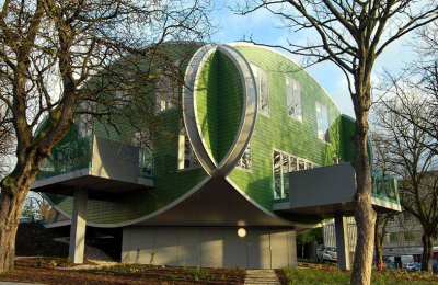
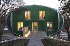
| + | Image:Maggies-3.jpg|Entrance: each elevation is framed in an oval of steel | ||
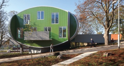
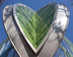
| + | Image:Maggies-5.jpg|The ears’ steel members spring out from the main frame and create the illusion of overlapping ovals | ||
| + | </gallery> | ||
'''Corner ‘ears’'''<br> | '''Corner ‘ears’'''<br> | ||
{{#image_template:image=File: Maggies-4.jpg|caption=The ears’ steel members spring out from the main frame and create the illusion of overlapping ovals|align=right|wrap=true|width=250}} | {{#image_template:image=File: Maggies-4.jpg|caption=The ears’ steel members spring out from the main frame and create the illusion of overlapping ovals|align=right|wrap=true|width=250}} | ||
Revision as of 12:13, 12 March 2019
Article in Building Design, Special – Steel Focus, 03/02/12
Care centre’s fearless symmetry
The unconventional geometry of CZWG’s Maggie’s Nottingham is made up of simple steel elements
Text by Pamela Buxton, photos by Martine Hamilton Knight
A distinctive elliptical steel frame forms the structure for Maggie’s Nottingham, designed by CZWG at the Nottingham City Hospital Campus. The centre opened in November with interiors by Paul Smith and is the 15th in the network of Maggie’s centres for cancer patients and their families.
High-quality architecture has always been important to Maggie’s centres, as demonstrated by the starry list of architects already engaged, including Zaha Hadid, OMA and Frank Gehry. Not that this has led to lavish budgets — the Nottingham centre, like many of its predecessors, is low cost — with a build cost of £1.45 million, working out at £4,000 per square metre.
The site was sloping and full of trees, providing a secluded environment despite its proximity to other hospital buildings. CZWG’s Piers Gough came up with the idea of designing an almost entirely symmetrical building held within a steel frame of interlocking ovals. The oval elevations give the building a friendly, welcoming appearance. Initially, the intention was to have a predominantly timber frame with a steel roof structure but it became clear that this was impractical to build given the site constraints, and a steel structure with timber infills was used instead.
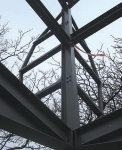
“A steel skeleton to form the overall shape with a timber infill was the quickest and most economic solution,” says Gary Lynch, a director of engineer Adams Kara Taylor. “What looks like a quite complex shape is broken down into very simple elements.”
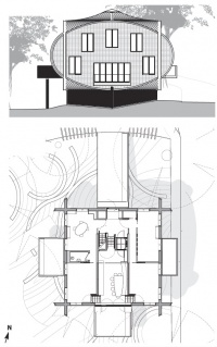
The 360sq m building stands 11m high and is arranged in two storeys within a steel superstructure above a reinforced concrete basement pedestal. The basement is pulled back as far as possible from the roots of nearby trees and this, combined with the overhangs created by a 45-degree rotation to the superstructure, gives the effect of the building seeming to “float” on the smaller basement. This arrangement limits views in from ground level, giving visitors to the centre privacy from passers-by.
Visitors enter via a steel bridge into a central lobby and travel down to a double-height area housing the kitchen, library and meeting rooms or up to two consultation rooms, a day bedroom and a large meeting space. This upper area is intended as a more secluded area for resting or private conversations, while the generous balconies extending from the kitchen and sitting rooms encourage visitors to enjoy the leafy setting if they desire. The exterior is clad in green glazed tiles and the building is topped off with an aluminium roof. Inside, colourful furnishings and furniture designed by Paul Smith are intended to be both comfortable and conversation points.
For steelwork contractor Shipley Structures, the big challenge was the unconventional geometry of the 40-tonne steel carcass, which was erected in just two weeks.
“There is a lot of curving on the building — the overlapping elliptical structure that creates a cantilevered effect and the roof itself, which is created in an ‘s’ shape which meets in a central raised point,” says Glynn Shepperson, a director of Shipley Structures.
“It’s beautifully detailed,” says CZWG’s Gough. He had the idea for the ovals when he was looking through a book by Maggie’s centres co-founder Maggie Keswick Jencks on Chinese gardens, on which she was an authority. “I saw these Moon Gates which are circular holes that you walk through and I played with that as a solid form. A circle was too high so it became an oval, which was the shape that fitted the two-storey building we’d decided to do.
“The idea was to make a refuge nestling into the tree. It is almost perverse in its symmetry. It seemed intriguing to do a building that wasn’t free-form; the landscape around it is quite loose and free so the building could become symmetrical. The conceit is that the elevations are all ovals and they interlock like a Canadian log house.”
Steel frame construction
Trusses and deck
The roof was the only part of the frame made of curved steel
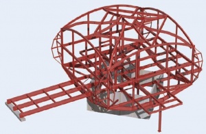
Four large fabricated steel trusses form the perimeter base of the structure, one at the base of each elevation. These transfer the super-structure loads to the concrete pedestal and taper to form the striking curved effect at the base of the building.
This steel deck also provided a stable platform from which to build with a minimum of temporary works. Each of the four sides of the building are constructed off this deck, with a total of 24 columns within the elevation including the four corner posts. These corner columns link the lower curve to the four curved eaves beams that link to create the symmetrical and elliptical form.
Steel support is provided internally for a central lift shaft and three split-level floors. The light steel, fully bolted skeleton is infilled with straight timber members. According to engineer Adams Kara Taylor, this system provided a simple and fast construction method to create an otherwise complex shape. The timber stiffens the steel frame against wind loads and out-of-balance loads created by the slight asymmetry of the steel frame.
Cantilevered balconies
Cantilevered, steel-framed balconies project from three sides, along with a pedestrian bridge to the rear elevation that provides direct access into the building at first-floor level. All four external frames were provided with perimeter balustrading, integral seating and are clad in a combination of glazed, timber and metal louvre panels. Of the balconies, one is a true cantilever and two are cantilevers with prop supports.
Roof contours
In order to maintain the slimline effect of the structure and create a more cost-effective solution, the design used higher strength steel sections in grade S355 material. This provided one of the biggest structural steelwork challenges. Where at all possible on the building, curved steel was avoided but its use was essential to create the desired roof contours. Here, the eaves are formed by curved 12.9m beams.
From each corner spring S-shaped fabricated rafters that converge at a square glazed roof light at the crown of the roof. Four further curved beams link the corner of each roof light to the centre of the eaves. Otherwise, straight members are used to form the roof structure.
“I’m particularly proud of the roof. It’s really pretty and comes out of the geometry of the corners,” says Gough, adding that the similarity to a Chinese pagoda is a homage to Maggie’s interests and background.
Corner ‘ears’
The projecting “ears” — two per corner — give the illusion of intersecting but the oval form of the main steel frame actually terminates at a concealed corner column. “It does look like its one continuous shape that’s curving round,” says Shipley Structures’ Glynn Shepperson. Instead, members on welded ladder frames spring out to give the corners of the building their distinctive overlapping form.
Although these appear curved, each ear curve is made up of four members tied to the corner column by three horizontals that pick up the wind load. The top diagonal member takes the load of the rest of the ear, which is infilled in timber. Each ear aligns with the curve of the roof and the underside of the building to create an oval.
| Architect | CZWG |
| Interior Design | Paul Smith (Interiors) |
| Structural Engineer | Adams Kara Taylor |
| M&E Consultant | KJ Tait Engineers |
| Steelwork Contractor | Shipley Structures Ltd |
| Main Contractor | Bowmer & Kirkland Building Services |
| Client | Maggie’s Cancer Caring Centres |


